Desert Online General Trading LLC
Dubai, United Arab Emirates
Desert Online General Trading LLC
Dubai, United Arab Emirates


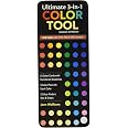
Ultimate 3-in-1 Color Tool: -- 24 Color Cards with Numbered Swatches -- 5 Color Plans for each Color -- 2 Value Finders Red & Green


K**S
Usefull to mix colors (Graphic Design)
I used it to decide on colors for some packaging and needed just a bit of safety to compare it with my screen colors. Some colors you might have to imagine the result of a mix of two that you have on the fan (You wont be able to get all 3 colors mixed, it is always 2 plus Black, some extra pages with 25/50/75% mix of a third would be awesome for the next version!) , but for the price, that's fine and I found it plenty helpful. Its also very easy to hold two colors together unlike in the books that are more complex and the colors are somewhere in the middle of the page. You end up trying to get colors next to each other by bending pages, which of course isn't ideal.
C**E
NEW "Ultimate 3-in-1 Color Tool" is terrific!!
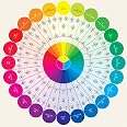
I was so excited to get the new 3-in-1 Color Tool Ultimate 3-in-1 Color Tool: -- 24 Color Cards with Numbered Swatches -- 5 Color Plans for each Color -- 2 Value Finders Red & Green to see what changes Joen Wolfrom had made from the original. I was extremely pleased to see that she'd put on the front of each color card the very things I had to keep turning the old one over to see - the color plans that make the tool so unique. So now I can quickly turn to a color that I want in my quilt (or even what I'm planning to wear that day!) and see which colors are going to make my choice of color work together for a successful project. And she's also expanded the tints, tones and shades for each color on the back. Although I don't personally have a need for the color formulas on the back, I know that others who use color in their work will find them extremely valuable. It's not easy to take something that is good like the original 3-in-1 Color Tool, and make it better, but Joen has certainly done that!! And the frosting on the cake is the new Studio Color Wheel that goes with it.Studio Color Wheel: 28 x 28 Double-Sided Poster
O**E
Plastic screw post was broken.
Might have been due to being packed in a plastic shipping bag.Product itself is extremely useful. Luckily I was needing it at home, and was not needing to use it off-site.I have purchased a metal screw post to fix it, as I really like the product! I look forward to using it for years to come.
N**T
Terrific Start, Please Add Nine More Cards plus Grays
This is a very useful tool which I'd love to see just slightly expanded to be even more valuable. I was looking for a way to jump-start the process of explaining saturation/clarity/intensity of color to people and helping them find their best saturation level for wardrobe purposes. This tool gets me most of the way there as it does show about seven saturation levels for each of 24 pure hues.However, as you look around the hue circle through the 24 hues supplied, there are noticeable jumps or discontinuities. I'd love to see nine cards added: 3.5, 7.5, 10.5; 12.5, 14.5, 18.5; 22.5, 23.5, 24.5/0.5. This would give a more continuous set of hues. While saturation is key, hue is second to it and it would be great to have a more even set of jumps from hue to hue in this collection.What got me thinking about this in the first place is that I couldn't find a true red, a true blue, or a true yellow in the deck--each blue is either a little on the purple side or a little on the teal side, each red is either a bit to the orange side or a bit to the purple side, and each yellow is a bit to the red side or a bit to the green side, compared to what I'd consider a true red, blue or yellow with no overtones or tilt.Where this really causes difficulty for some people is this. If you have some yellow or a related tone in your skin, you will be just right with these "off of true" shades of blue and red, but if you don't, you need those "on true" shades as part of your lineup. It's a shame to have to ask people to extrapolate those colors.I'm indebted to a thirty-year-old or so copy of a book called Color Wonderful for the saturation emphasis--it was invaluable to me and I still think completely on target. But it's important (and they know this too) to know your best hues as well as your best saturation level.If this little tool were expanded just a bit it would be a huge help in explaining these concepts and giving the best wardrobe help to others informally.It would also help to have several gray cards included for wardrobe purposes.
J**.
3 in 1 color tool
work well.
L**E
A great tool for color analyzing
I like this tool better than a color chart. It fits in my purse and each page plastic coated. I like that it gives different hues, tones, tints, and shades. It's great for quilters. It also gives different color combinations that go together i.e., complimentary, analogous, triadic, tetradic, etc. looking at paint swatches or fabric, I can tell if it is an aqua or a blue.
J**S
Informational!
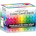
There are a few informational pages in the front explaining tints, tones, and hues which are great. The color cards are awesome because they tell you how to mix dyes or paints for particular colors - the main reason I bought it. There is a lot more than that as well which is explained on the product page. I agree with others that the manufacturer should laminate the pages. I might remove the attachment at the bottom and replace it with a binder ring so it will be easier to use.
P**N
Handy for several uses!
I keep one in my art studio for obvious reasons and the other in my car for when I go to the floral nurseries! I love to use this for choosing complimentary plants to those already chosen. I also use it when choosing clothing. This is such a handy tool as it has every color. This is very easy to use as well and small enough to leave in the car console and then fit into my purse.
Trustpilot
Hace 2 meses
Hace 2 semanas