🎨 Elevate your art game with every stroke!
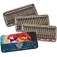
Derwent Chromaflow Pencils set includes 150 vibrant, highly pigmented colored pencils featuring a strong 3.5mm round core designed for smooth blending, shading, and layering. Housed in a durable tin with a screw cap, these professional-quality pencils resist breakage and are ideal for artists seeking bold, blendable colors for drawing, coloring, and crafting.


| Manufacturer | Derwent |
| Brand | Derwent |
| Model number | 2306263 |
| Product Dimensions | 21 x 42.8 x 3.8 cm; 6 g |
| Color | Assorted |
| Closure | Screw Cap |
| Grip Type | Contoured |
| Material Type | Tin |
| Number of Items | 1 |
| Size | 150 count (Pack of 1) |
| Point Type | Bold |
| Line Size | 2mm_and_above |
| Ink Color | Multicolor |
| Manufacturer Part Number | 2306263 |
| Item Weight | 6 g |
Trustpilot
1 day ago
2 days ago